Global Migration Flows
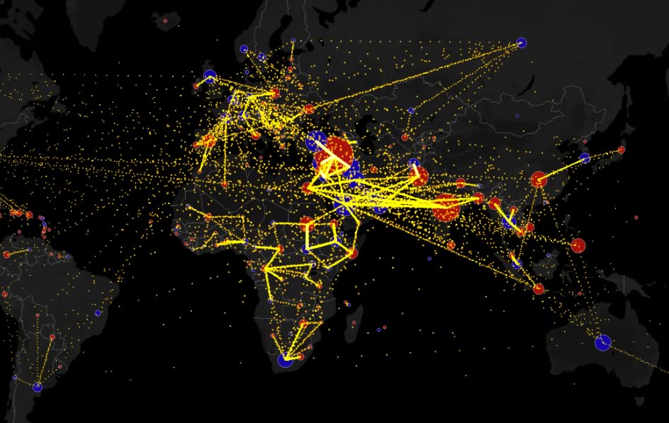
This map shows the estimated net immigration (inflows minus outflows) by origin and destination country on the example of Syria between 2010 and 2015.
Hover over a circle to see that country’s total net migration on the map below between 2010 and 2015. Click a circle (or tap the circle twice on mobile) to view only the migration flows in and out of that country.
The data for this map comes from the UN Population Division’s estimates for Total Migrant Stock — the number of global migrants, broken down by country of residence and country of origin. The numbers are not fully consistent. In some cases, they represent foreign citizens and in others they represent foreign born. See the dataset itself for the full set of footnotes.
The map application was created by Max Galka a NYC-based entrepreneur.
To convert those figures into immigration estimates, he took the difference between the migrant stock in 2015 and that in 2010. Since some of that difference is due to mortality, not immigration, he adjusted the 2010 numbers down assuming an annual mortality rate of 0.8%, the global average.


Tags: Europe, exile, migration flows, refugees, Syria
Trackback from your site.