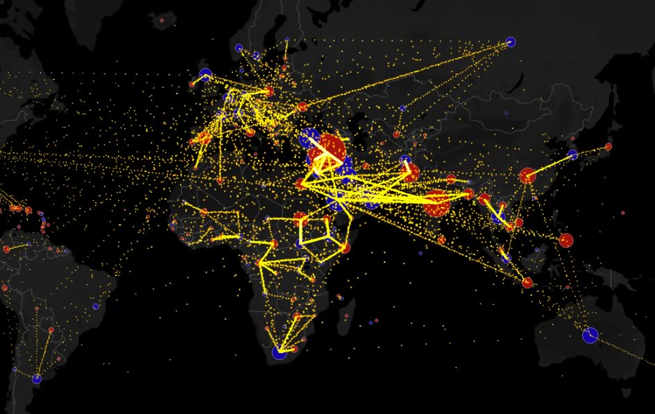
Global Migration Flows

This map shows the estimated net immigration (inflows minus outflows) by origin and destination country on the example of Syria between 2010 and 2015.
Hover over a circle to see that country’s total net migration on the map below between 2010 and 2015. Click a circle (or tap the circle twice on mobile) to view only the migration flows in and out of that country.


